PhyFarm is a smart farming app that lets farmers control everything—from irrigation to crop monitoring—right from their phone. With sensors and controllers in the field, it provides real-time data, automates tasks, and helps make better decisions with useful insights
I led end-to-end user research and discovery workshops to improve the onboarding flow for PhyFarm’s mobile app. My work focused on improving the initial user experience to minimize confusion, foster trust, and accelerate user adoption.

Users of our AgriTech mobile app are experiencing difficulties with navigation and lack familiarity with the interface, resulting in frustration and reduced overall engagement
Users experience high drop-off rates during the initial farm setup due to a lack of clear guidance and overwhelming steps. To address this, we introduced a progressive onboarding flow that gradually introduces key features while guiding users to input essential details such as farm location, size, and crop types. This learn-by-doing approach helps users feel more engaged, reduces the learning curve, and ensures an efficient and smooth setup process from the start.
Our users are farmers who often feel overwhelmed when it comes to getting started. They don’t need more manuals — they need clear, personalized guidance that helps them navigate setup and understand the process from day one, in a way that fits into their busy routine.
To understand the problems faced by new users, I teamed up with my product manager and started looking at support tickets, and started digging into analytics. We found 3 main problems.
I began by mapping out the user journey for the existing process. Collaborating closely with the product manager and engineers, we identified crucial steps and brainstormed ideas to reimagine a more efficient flow.
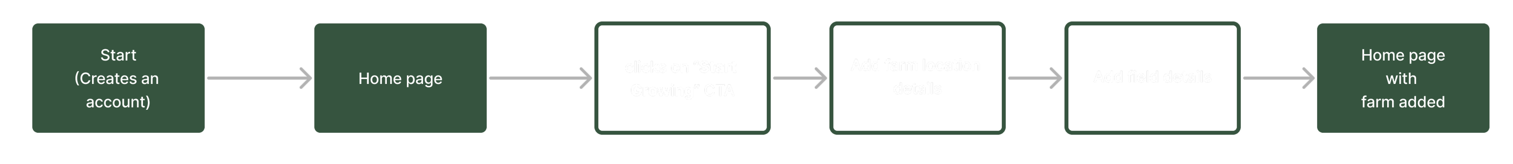

In crafting wireflows, I aimed to intricately map out user journeys with visual precision, combining the structure of wireframes with the narrative flow of user flows. Each wireflow meticulously outlines the sequence of screens and interactions, providing stakeholders with a comprehensive understanding of the user experience. By seamlessly integrating wireframes and user flows, these dynamic wireflows serve as a powerful tool for communicating design concepts, facilitating collaboration, and ensuring alignment between design and user goals

In this phase of the design process, I focused on refining and enhancing the user experience through high fidelity designs. By meticulously translating conceptual ideas into tangible visual representations, I aimed to provide stakeholders with a clear vision of the final product while ensuring alignment with user needs and design goals. Through attention to detail, consistency in visual language, and adherence to usability principles, my high fidelity designs offer a realistic preview of the app's interface, interactions, and functionality

The onboarding process led to a 30% drop in drop-off rates, a 70% task completion rate, and a user satisfaction score of 8, signaling enhanced user engagement and comprehension.

